Refreshing Colormix
Last summer, I built a tool to help visualize the CSS color-mix function. colormix.style lets you mix two colors in a given color space and generates the CSS snippet needed to do that with color-mix.
For the MVP, I was focused on building the bare minimum to get the idea across. Since then, browser support for color-mix as improved. More people are experimenting with and writing about color-mix and the huge amount of new color-related features in CSS. And, my understanding of color-mix and more importantly how new CSS color capabilities work as expanded.
With all that, I’m taking the time to iterate colormix.style beyond an MVP into a more robust, more useful tool.
What’s new?
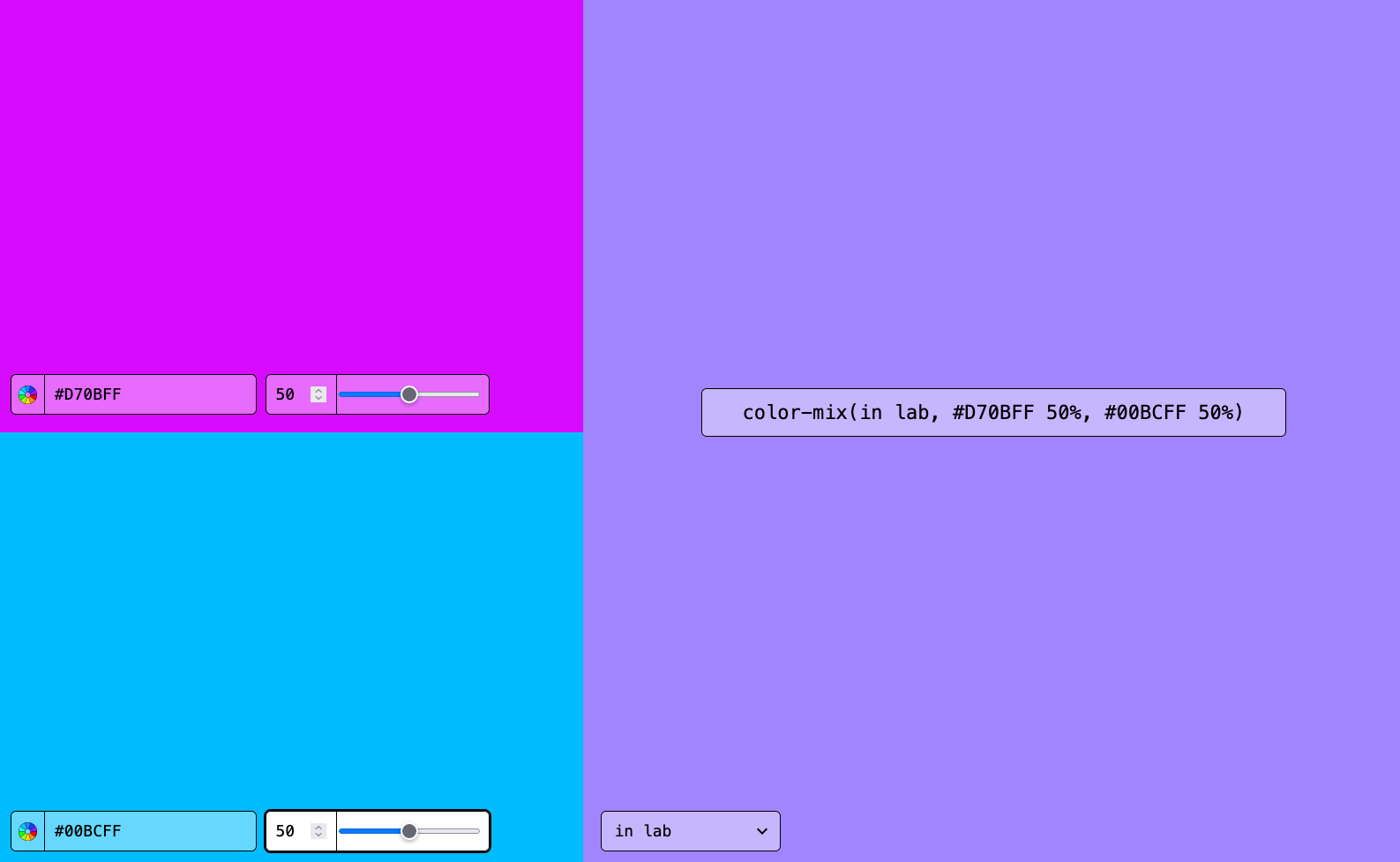
To be able to make the larger functionality and usability improvements I wanted, the first thing I needed to do was take another stab at the overall UI. I had an idea for what I wanted when I designed the MVP, a spartan UI where every pixel of the UI was part of the tool, free from any design embellishments. That idea can work, but I didn't execute on it well enough.
It also felt like my original design put too much emphasis on the color input vs the output. The two color inputs, while important, aren't the main idea. The output color of the operation is.
With those things in mind, I got to work reimagining and refreshing the UI.
MVP design

The basic utility was there, but it just wasn't what I knew it could be. As I used it more, and thought about new functionality I wanted to include, this design wasn't going to work going forward. Also, aesthetically it wasn't at the level of completeness or fidelity that I wanted.
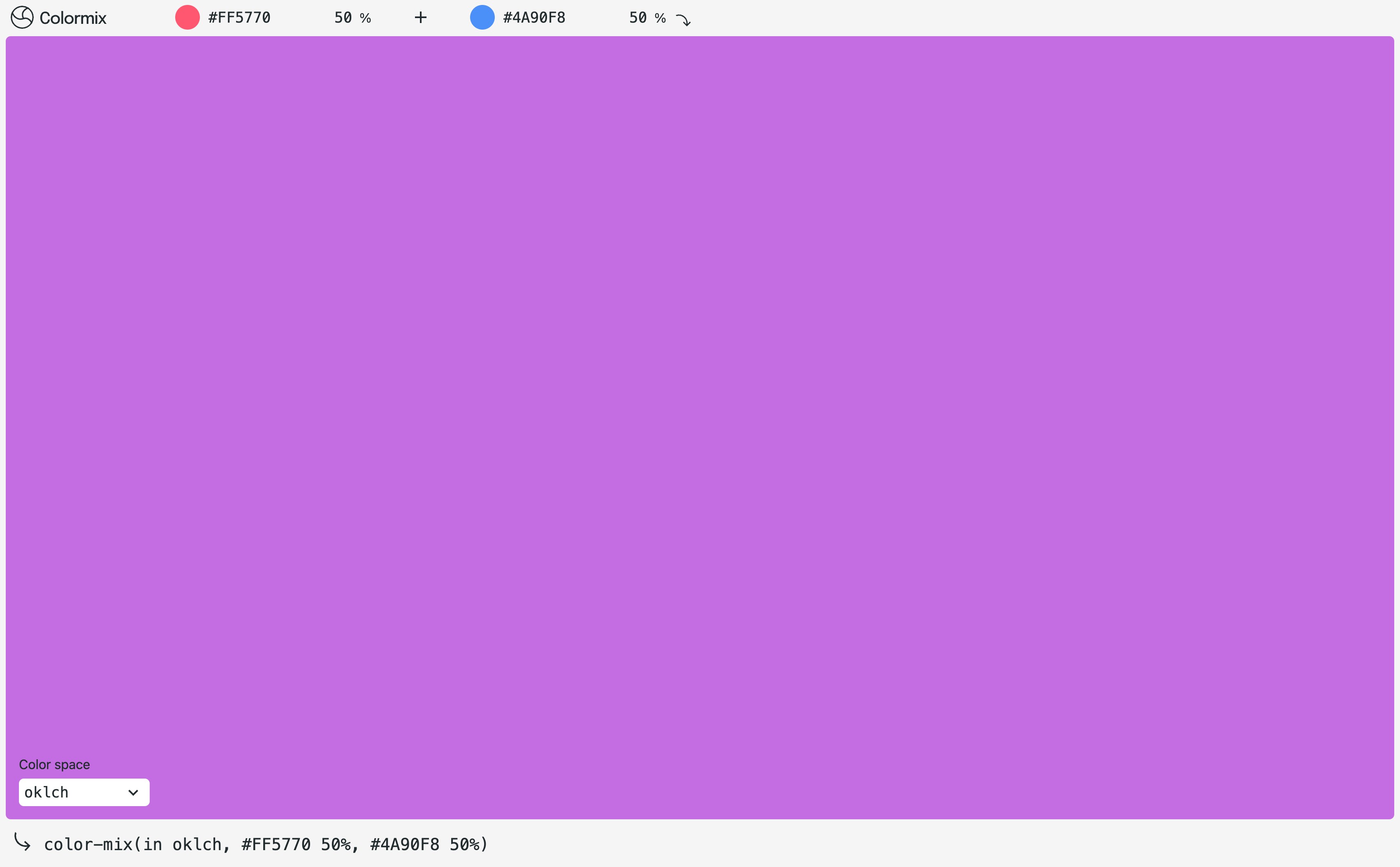
Refreshed design

First, just aesthetically, this is easier to look at. Part of that is just due to me spending more time to get details right. And I think I think I "designed the bad" out with the MVP, which is a common exercise for me. The focus is now clearly on the output color. I have more to do here, but this sets the foundation for those future improvements.
I let go of trying to have every pixel be part of the functionality. There’s whitespace in the header and footer and around the color output container. It's not a ton, but just enough to help push focus to the interactive elements on the page.
This is a utility tool so functionality will always be key, but I also let myself get away with a couple design flourishes with the plus and arrow icons. A couple tiny details to break up the matter-of-factness of the rest of the design.
Removing the percentage slider
One thing I removed was the slider to control the mix percentage. The number input is the only way to control mix percentage now. We'll see if this ends up being the right decision. I took inspiration from design tools for this. I noticed that in Figma when controlling percentages like opacity, the only control is the text input. I've never once wanted a slider for that. I think that's partially because we don't tend to make large up or down changes. If we do need to go from say 100% to 10%, it's faster to backspace or just type "10".
One improvement I'll add here is the ability to hold the shift key with the up and down arrow keys to increment by 10. That's something I reach for in Figma and other similar tools often and feels necessary.
What’s next?
This UI refresh is a first and largely cosmetic step for improving the tool. I have a list of new functionality I'm working on already and will continue to work on in the coming weeks/months.
The most important functionality addition will be to allow for all color spaces in color inputs. Right now I only have rgb via hex. This drastically reduces the functionality and blunts the future-looking nature of the tool. The introduction of new color spaces in CSS is huge and exciting. This tool will provide a way to work with them soon.
You can follow the full list of what I'm up to on Github issues. If you see something broken or have an idea, feel free to add an issue there.
Credits
I've been taking heavy UI and functionality inspiration from Adam Argyle’s gradient.style and learning a ton about new CSS color capabilities from his article "High Definition CSS Color Guide".
If you have thoughts about this post, email me@tylergaw.com or ping me on Bluesky.
This post is also available as Markdown.